
Te Papa earthquake interactive
Exhibition design + Science communication
My role
User experience and visual design
Team
Dan Newman — Creative Director
Josh Twaddle — Visual Designer
Joris Rotteveel — Front End Developer
Cameron Bourgeois — Backend Developer
Jonny Doig — Project Manager
Client
The Museum of New Zealand Te Papa Tongarewa
Overview
In 2019, the Museum of New Zealand Te Papa Tongarewa undertook a significant revamp of their nature exhibitions after 21 years of educating visitors about New Zealand's unique flora, fauna, and geography. They tasked us with designing and building a data-driven digital experience for the new Whakarūaumoko Active Land exhibition in the zone. We created Quake Nation, a large interactive touchscreen that enables museum-goers to discover that earthquakes are not one-off events, but spikes in an ongoing sequence of tremors.
Awards
Spatial Excellence Best Map — New Zealand Cartographic Society
Best Awards Finalist Digital — Designers Institute of New Zealand

Designing a data-driven experience
In 2019, the Museum of New Zealand Te Papa Tongarewa undertook a significant revamp of their nature exhibitions after 21 years of educating visitors about New Zealand's unique flora, fauna, and geography. They tasked us with designing and building a data-driven digital experience for the new Whakarūaumoko Active Land exhibition in the zone. We created Quake Nation, a large interactive touchscreen that enables museum-goers to discover that earthquakes are not one-off events, but spikes in an ongoing sequence of tremors.
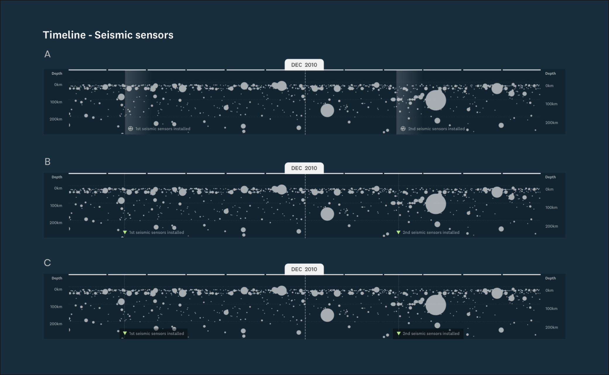
Exploring earthquake history with a scrollable timeline
The scrollable timeline allows users to explore the entire GeoNet earthquake dataset, dating back to 1810. The GeoNet API not only provides historical data but also feeds live data every few minutes and alerts users when an earthquake above a specific magnitude is detected. Each earthquake is represented by a white bubble on the timeline, with the bubble's vertical position indicating epicenter depth (up to 200 km) and the horizontal position showing the date. The bubble's size corresponds to the earthquake's magnitude - the larger the bubble, the stronger the quake.

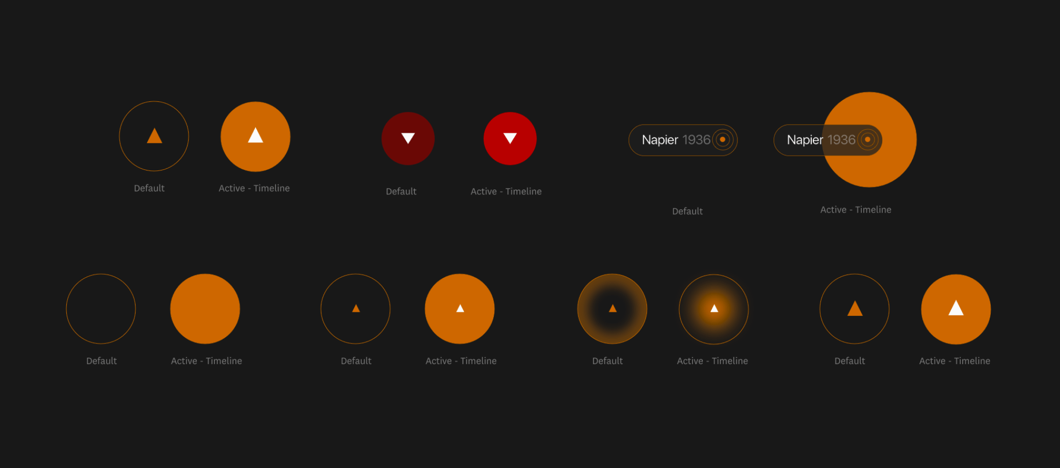
Creating an accessible user interface
We designed the user interface to be fully accessible. Text and interactive elements feature contrasting colours, making the information easier to see for people with colour blindness or visual impairments. The screen's height and viewing angle cater to kids and those interacting with it from a wheelchair or mobility scooter. The design complies with accessibility standards and offers bilingual content in te reo Māori and English.